Simplifying the Daunting
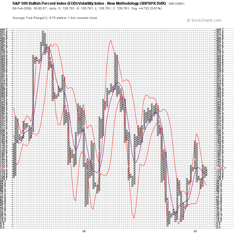
In an effort to create better charts, I’ve changed some of the variables to create a cleaner visualization of the Bullidex.
The red lines are Bollinger bands set 3σ from the purple 5sma. The new green X in the right most column indicates decreasing volatility coupled with a higher percentage of stocks rising in the SPX.
This chart suggests a short term bullish bias in a predominantly bearish environment. As a day trader, I’m looking to get long, but my position size is small due to the relatively high volatility.
